Advertisement
Working with timeseries data is part of many real-world tasks. From stock prices and temperature changes to website traffic and sales trends, dates and times help tell a story that raw numbers can’t. But numbers don’t speak for themselves. That’s where a Matplotlib timeseries line plot becomes useful. It gives shape to change and makes trends easier to spot.
The basic line plot, paired with date values, does a lot with just a little effort. And the good part? Python and Matplotlib give you the tools without a lot of complexity. With the right setup, you can quickly move from a CSV file to a clean plot that tracks values over time.
To get started, you need to import the core libraries: matplotlib.pyplot, pandas, and optionally datetime. Pandas is especially helpful when handling time-indexed data. Say you have a CSV with daily temperature readings. When loaded into a DataFrame, you just need to convert the date column into a datetime object. Pandas makes this easy with pd.to_datetime(). Once that’s done, plotting is simple: use plt.plot() and set the x-axis as the datetime column and the y-axis as your measurement.
Matplotlib automatically formats the x-axis labels, especially if the time range is long. It will stagger the dates, angle them, or skip some to avoid clutter. But you can take control using plt.xticks(rotation=45) or mdates.DateFormatter() for custom formatting. This matters when your timespan covers multiple years or zooms in on minutes or hours.
Behind the scenes, Matplotlib relies on matplotlib.dates for date handling. That module provides locators and formatters that let you split the x-axis into months, days, or years. If your dataset includes a year’s worth of daily sales, mdates.MonthLocator() and mdates.DateFormatter('%b %Y') can cleanly label each month, keeping the graph readable.
Real-world timeseries data is rarely perfect. You might have missing entries, irregular time intervals, or duplicate timestamps. Before plotting, it’s good to clean the data. Pandas lets you fill missing values with fillna(), drop them with dropna(), or resample the data using .resample('D').mean() to smooth irregular gaps. If you want to highlight data gaps instead of smoothing them, just leave the missing parts and let Matplotlib handle the breaks in the line.

Another common case is plotting more than one timeseries on the same plot—say, comparing temperatures from two cities. You just call plt.plot() multiple times before running plt.show(). Be sure to label each series using label=, and then call plt.legend() to keep things clear. If you want to compare things that vary widely in range, like population and rainfall, you can use twinx() to create a second y-axis on the same plot.
For more detailed timeseries visualization, you can stack subplots using plt.subplot() or plt.subplots(). This helps when showing different trends on the same time frame without mixing them. Each subplot can focus on one variable, making the full chart easier to read and interpret.
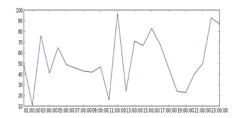
When your time resolution gets finer, like hourly or minute-by-minute data, you may notice the x-axis becomes cluttered. That's where setting tick locators manually helps. Use HourLocator, MinuteLocator, or even SecondLocator to adjust the x-axis ticks to your dataset’s granularity. And combine that with DateFormatter to show precise time like '%H:%M' or '%H:%M:%S'.
Making your timeseries line plot visually clear goes a long way. Matplotlib lets you adjust almost everything. You can change line color, width, and style with parameters like color=, linewidth=, and linestyle=. To make trends more readable, try using dashed lines for projections or different colors for different time ranges.
For clearer comparison, adding gridlines with plt.grid(True) often helps. You can also highlight specific periods using axvspan() for vertical spans or axhspan() for horizontal zones. This is useful if you want to mark holidays, economic events, or sudden drops in performance.
Annotations add another level. With plt.annotate(), you can point out peaks, dips, or other relevant spots. Choose a clear message, place it near the data point, and use an arrow to connect it. This is useful when presenting your plot to others, as it removes guesswork from interpretation.
Legends, titles, and axis labels are simple but often ignored. Set them with plt.title(), plt.xlabel(), plt.ylabel(), and always label your series. This becomes critical when you're plotting multiple series on one graph.
If you’re sharing your plot in a report or dashboard, saving it is easy. Use plt.savefig('filename.png', dpi=300) to export a high-resolution image. You can also save it in vector format using .svg for clearer scaling. If you need it inline for a Jupyter Notebook or web interface, just use plt.show().
Timeseries plots can also be interactive when using libraries like plotly or embedding Matplotlib inside a GUI. But for many use cases, static Matplotlib plots offer the balance of speed, clarity, and control. They’re well-suited for both quick data checks and production-grade reporting.
One of the key parts of building a good Matplotlib timeseries line plot is handling the time axis correctly. If your labels are too dense or poorly formatted, the entire plot becomes hard to read. Matplotlib’s dates module gives full control over how dates and times appear. You can choose specific intervals using locators like DayLocator, MonthLocator, or YearLocator, depending on the span of your data.
Once you set the locator, combine it with DateFormatter to display the labels cleanly, like showing abbreviated months for a year-long chart or full timestamps for high-frequency data. This customization helps your timeseries plot match the story you're trying to show, whether zoomed out across years or focused down to the second.
A Matplotlib timeseries line plot is one of the simplest yet most effective ways to visualize how values change over time. It works well for clean or messy data, short or long periods, and single or multiple series. With just a few tweaks, it can turn raw numbers into clear visual stories. Whether you're tracking trends, comparing metrics, or presenting results, Matplotlib gives you the tools to make it clear, readable, and useful without getting in the way.
Advertisement
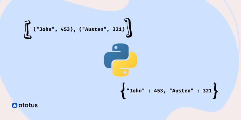
Learn how to create a list of dictionaries in Python with different techniques. This guide explores methods like manual entry, list comprehensions, and working with JSON data, helping you master Python dictionaries

Explore Google's SGE AI update for images, its features, benefits, and impact on user experience and visual search

Learn 7 different methods to convert a string to bytes in Python. Explore techniques like encode(), bytes(), and bytearray() to handle data conversion effectively in your Python projects

Meta launches an advanced AI assistant and studio, empowering creators and users with smarter, interactive tools and content

Here’s a breakdown of regression types in machine learning—linear, polynomial, ridge and their real-world applications.
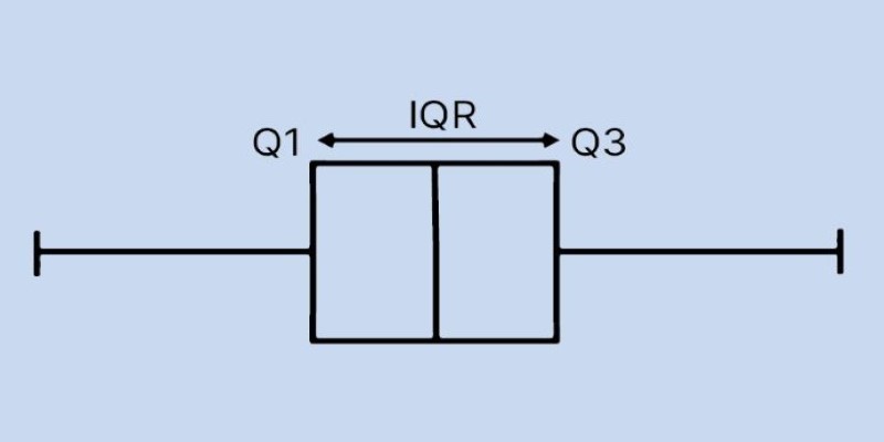
Learn how to create and interpret a boxplot in Python to uncover trends, spread, and outliers in your dataset. This guide covers structure, plotting tools, and tips for meaningful analysis

Discover how Otter.ai uses GenAI to enhance meetings with real-time insights, summaries, and seamless cross-platform access.

How to use the set add() method in Python to manage unique elements efficiently. Explore how this simple function fits into larger Python set operations for better data handling

Unlock the power of Python’s hash() function. Learn how it works, its key uses in dictionaries and sets, and how to implement custom hashing for your own classes

Discover 10 examples of AI in the Olympics. Judging scores, injuries, and giving personalized training in the Olympics.

Explore the key benefits and potential risks of Google Bard Extensions, the AI-powered chatbot features by Google

Discover how insurance providers use AI for legal contract management to boost efficiency, accuracy, risk reduction, and more