Advertisement
Every dataset has a story. But before diving into charts and models, it's helpful to see the shape of that story. A boxplot is one of the simplest ways to summarize a dataset. It doesn’t require heavy computation or flashy graphics. What it shows is direct: how your data spreads, where the middle sits, and if something looks off. When you're dealing with numeric values—like test scores, income, or daily temperatures—a boxplot tells you what’s typical and what’s rare. It's a go-to tool when you need to compare different groups side by side or spot outliers fast.
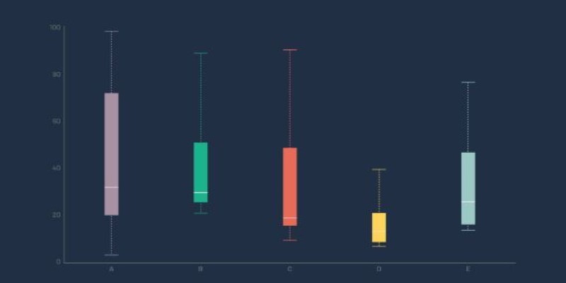
A boxplot may look basic, but each part of it carries meaning. The central box shows the interquartile range, or the middle 50% of values. The line inside the box is the median. Lines extending from the box, often called whiskers, stretch out to the lowest and highest values that are not considered outliers. Anything beyond these whiskers—either very low or very high—is usually marked as an individual point and flagged as an outlier.
The lower quartile (Q1) sits at the 25th percentile, while the upper quartile (Q3) marks the 75th. The interquartile range (IQR) is simply Q3 minus Q1. This range tells you how spread out the middle portion of your data is. A narrow box means the values are close together, while a wider box means more variability. The whiskers often stretch to 1.5 times the IQR beyond the quartiles, but that depends on how the tool you're using defines them.
What's so great about a boxplot is that it is so condensed and to the point. You look at it and easily determine whose group has higher values, greater spread, or outliers. This comes in particularly handy when comparing sets side by side. If you're comparing salaries within departments or scores within schools, boxplots allow you to compare distributions visually rather than averages.
Python provides a few clean ways to build boxplots, mainly through libraries like Matplotlib and Seaborn. Both options are easy to work with, especially if your data is in a Pandas DataFrame.
With Matplotlib, you use plt.boxplot() after importing matplotlib.pyplot. This function can take in a list, an array, or a column from your DataFrame. If you want to create multiple boxplots—say, comparing several columns or categories—you can pass a list of lists. By default, Matplotlib draws vertical boxplots, but you can make them horizontal with a simple flag.
Seaborn offers a slightly higher-level approach. Using sns.boxplot(), you can pass in your x-axis category and y-axis numeric values, along with the DataFrame. Seaborn takes care of much of the formatting, colors, and layout. If you're working with grouped or categorized data, it’s often the better choice. For example, plotting student test scores across different schools becomes as simple as providing the column names for school and score.
Both tools allow for custom tweaks. You can change the color of the boxes, adjust the whisker range, add labels, or combine the boxplot with other plot types like swarmplots or stripplots to show individual data points. This makes it easier to see both the summary view and the raw values together.
In short, creating a boxplot in Python is a low-effort way to get high-impact insight. It tells you a lot with very little code and works well whether you're just exploring or preparing to present.
A boxplot isn’t just about the chart—it’s about what it means. When interpreting a boxplot, it's easy to focus only on the median, but the spread is just as important. Two datasets can have the same median but very different variability. The length of the box and whiskers gives context that the average alone would miss.
Outliers in a boxplot don’t always mean something went wrong. In some cases, they’re the most important part of the story. For instance, if you’re looking at delivery times, a cluster of outliers may point to operational problems. On the other hand, some fields—like sports or finance—regularly show extreme values. In such cases, what looks like an outlier might be just part of normal behavior.
It’s also common to see people misinterpret skewness. A box that’s pulled toward the lower end doesn’t always mean most values are low—it just means the spread is tighter on one side. A boxplot helps show skew, but doesn’t replace a histogram or density plot. You should use it in combination with those if you need to dig deeper.
Boxplots work best when you have enough data. Small sample sizes can give misleading results, where a few values make the plot look skewed or full of outliers. And if you’re working with data that has multiple peaks or modes, a boxplot might not capture that well.
Despite these limits, boxplots shine when you’re doing comparisons. Whether it’s customer ratings across product lines or patient ages in different hospitals, they let you see differences at a glance. You don’t need to compute complex stats. The shape of the data tells its own story.
Boxplots may be simple, but they remain one of the most effective tools for summarizing data. They quickly show spread, median, and outliers without overwhelming you with detail. Whether you're comparing groups or spotting inconsistencies, boxplots give a clean overview that's easy to read. They highlight patterns that average values might hide. In Python, generating a boxplot is fast, as is the case with libraries like Matplotlib and Seaborn. These tools handle the visuals so you can stay focused on what matters—understanding your data. Whether you're exploring trends or sharing results, boxplots still offer one of the clearest views into a dataset.
Advertisement

Here’s a breakdown of regression types in machine learning—linear, polynomial, ridge and their real-world applications.

How to use the set add() method in Python to manage unique elements efficiently. Explore how this simple function fits into larger Python set operations for better data handling
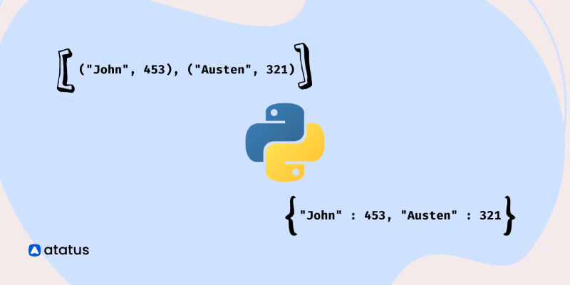
Learn how to create a list of dictionaries in Python with different techniques. This guide explores methods like manual entry, list comprehensions, and working with JSON data, helping you master Python dictionaries

Explore how AI and digital transformation improve automation through smarter data, decision-making, and customer interactions
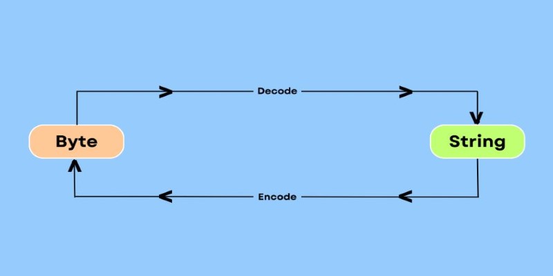
Need to convert bytes to a readable string in Python? Explore 7 clear and practical methods using .decode(), base64, io streams, memoryview, and more

Find how red teaming secures large language models against threats, vulnerabilities, and misuse in AI-driven environments.

Discover the risks of adversarial attacks in machine learning and how researchers are developing countermeasures.

Explore Google's SGE AI update for images, its features, benefits, and impact on user experience and visual search

Learn how Dell AI Factory empowers enterprises with intelligent automation, scalable AI systems, and real-time insights.

Find out how SharePoint Syntex saves time by extracting metadata using artificial intelligence, resulting in better output

Discover how insurance providers use AI for legal contract management to boost efficiency, accuracy, risk reduction, and more

Discover 10 examples of AI in the Olympics. Judging scores, injuries, and giving personalized training in the Olympics.